Skip Waste Australia Brand Identity for Waste Services
Background
Skip Waste AUS provides waste collection services across Victoria. The business needed a practical, recognisable identity that could communicate clearly in the field and remain consistent across vehicles, equipment, workwear, printed materials and digital touchpoints.
New Site Agency developed a focused visual system around a bold wordmark, a distinctive “W” device and a high-contrast blue palette.
The Challenge
Waste collection brands need to be understood quickly. The identity may appear on moving vehicles, large equipment, roadside signage or small digital applications, so it must remain clear at very different sizes and viewing distances.
The brand needed to:
- Make the Skip Waste name immediate and easy to read.
- Create a distinctive visual idea without making the category feel complicated.
- Feel modern, capable and dependable.
- Work in positive and reversed colour applications.
- Scale from compact digital placements to vehicles and waste collection equipment.
A Wordmark Built Around the “W”
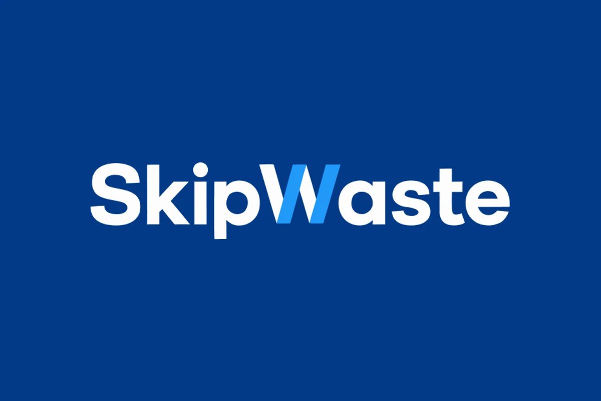
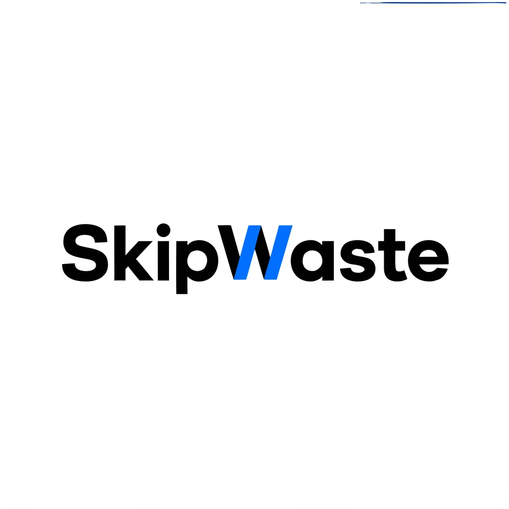
The Skip Waste wordmark uses strong geometric letterforms to create a direct, practical presence. Two angled blue strokes form the “W”, linking the two words while giving the identity its most recognisable feature.
The device introduces forward movement and provides an ownable point of difference without reducing legibility. It can remain part of the complete wordmark or become a recurring graphic cue within larger brand compositions.

A Practical High-Contrast Colour System
Deep blue gives the identity authority and a strong field colour, while the brighter blue “W” brings energy and visibility. Black and white applications provide straightforward alternatives for light backgrounds, documents and situations where the full brand colour is unavailable.
The limited palette keeps the system easy to reproduce and helps the wordmark stay consistent across operational and customer-facing materials.
Designed for Waste Collection in Victoria
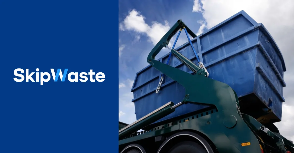
The identity was developed to sit confidently beside real waste collection equipment. The blue system connects naturally with the skip imagery, while the bold wordmark remains visible against photography and at the larger scale required for vehicles and outdoor applications.
Key Deliverables
- Brand positioning and visual direction.
- Primary wordmark and distinctive “W” device.
- Light and dark logo applications.
- Core colour and contrast system.
- Photography and composition direction.
- Scalable applications for vehicles, equipment, print and digital use.
The Outcome
Skip Waste AUS has a clear identity designed for the practical demands of a Victorian waste collection service. The wordmark is direct and legible, while the blue “W” provides a memorable element that can carry recognition across different formats.
The resulting system gives the business a consistent foundation for customer communications and operational applications without losing the straightforward character required in the category.