Hema Health Performance Brand & Website
Background
Hema Health brings performance blood testing into the training journey for runners, cyclists, triathletes and gym athletes. The service is designed to help people build a clearer view of the health markers that may influence endurance, recovery, sleep, iron status, hormones, inflammation and race readiness.
New Site Agency developed the brand, website strategy and UX/UI around a clear commercial goal: create a premium performance-health experience that aligned with ambitious athletes in Australia and the UK.
The Challenge
The brand needed to sit confidently between two worlds. It had to feel credible enough for a blood testing service while carrying the energy, focus and aspiration expected by a performance audience.
The project needed to:
- Position Hema Health as a premium performance brand rather than a generic pathology service.
- Make detailed health and biomarker information easier to understand.
- Build trust without making the experience feel overly clinical.
- Speak directly to athletes preparing, training and recovering for specific goals.
- Create a scalable digital foundation for Australian and UK audiences.
- Keep important medical context visible without overwhelming the core journey.
Building the Brand Architecture
The visual identity combines a precise geometric symbol with high-contrast serif typography. Deep blue provides authority and calm, while a lighter performance blue introduces energy and creates a clear secondary layer within the system.
The brand architecture separates the wider Hema Health proposition into focused expressions such as Work and Performance. Each retains the same core identity while gaining a distinct descriptor, giving the business room to speak to different use cases without fragmenting the master brand.


A Premium Performance Direction
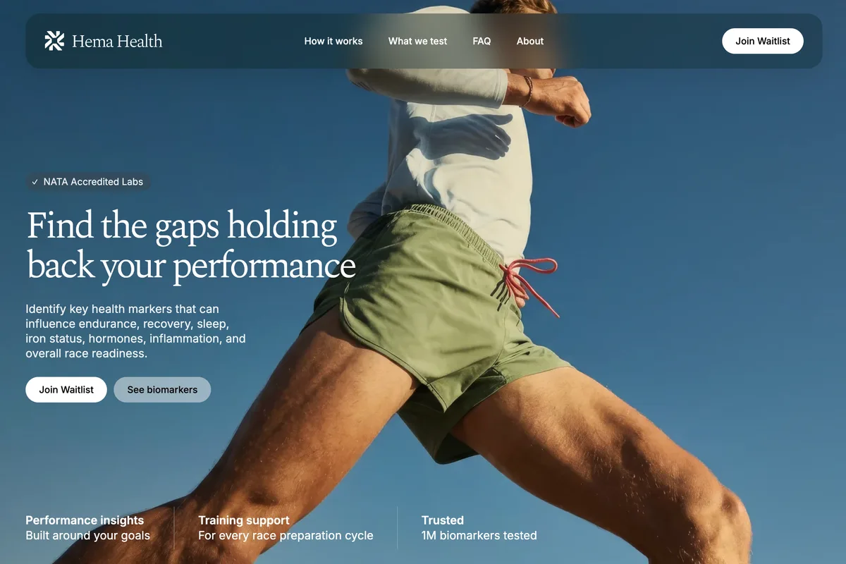
Athlete-led photography gives the identity momentum and keeps the service connected to real training goals. The imagery is confident and editorial rather than clinical, with the blue environment, natural movement and restrained typography creating a premium visual language.
The Hema Health mark and wordmark are designed to sit clearly over that imagery, allowing campaigns to remain recognisable without covering the athlete or diluting the sense of movement.

Website Strategy and UX/UI
The website opens with a direct performance proposition: “Find the gaps holding back your performance.” It connects the service to endurance, recovery and race preparation before introducing biomarker information, collection access and the athletes Hema Health supports.
The UX/UI system uses:
- A performance-led hero with clear primary and secondary actions.
- Concise trust signals placed close to the opening proposition.
- A structured race-preparation journey from baseline testing through training and retesting.
- Athlete-specific pathways for runners, cyclists, triathletes and gym athletes.
- Clear explanations that make technical health information easier to scan.
- Consistent waitlist actions across the page without interrupting the story.
- Visible health information and medical guidance within the wider experience.
The visual system carries the premium brand direction into navigation, cards, calls to action and responsive layouts while maintaining practical contrast and readability.

The Outcome
Hema Health now has a cohesive premium identity and digital experience built around the mindset of performance athletes. The brand balances health credibility with movement and ambition, while the website turns a complex subject into a focused journey from performance question to testing consideration.
The shared identity also provides a flexible foundation for extending Hema Health across markets and audience-specific offers without losing recognition or consistency.
Explore our approach to web development and digital health projects.