Aussie Music Store Brand Identity
Background
Aussie Music Store brings instruments, recording equipment, live-sound gear and accessories together for musicians across Australia. The brand needed an identity that felt unmistakably musical and local while remaining clear enough for a product-rich retail environment.
The project centred on creating a memorable visual idea that could move confidently from a compact logo to merchandise, campaigns and a complete e-commerce experience.
The Challenge
Music retail is visually crowded. Product photography, manufacturer branding, promotional messages and technical information all compete for attention, so the identity had to be distinctive without making the shopping experience harder to use.
The brand system needed to:
- Create a recognisable idea beyond a conventional music-store wordmark.
- Feel expressive and approachable while retaining retail clarity.
- Stay legible across navigation, search, packaging, merchandise and campaigns.
- Support both compact and high-impact compositions.
- Connect brand personality with practical product discovery.
A Recognisable Australian Music Identity
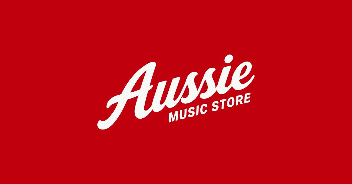
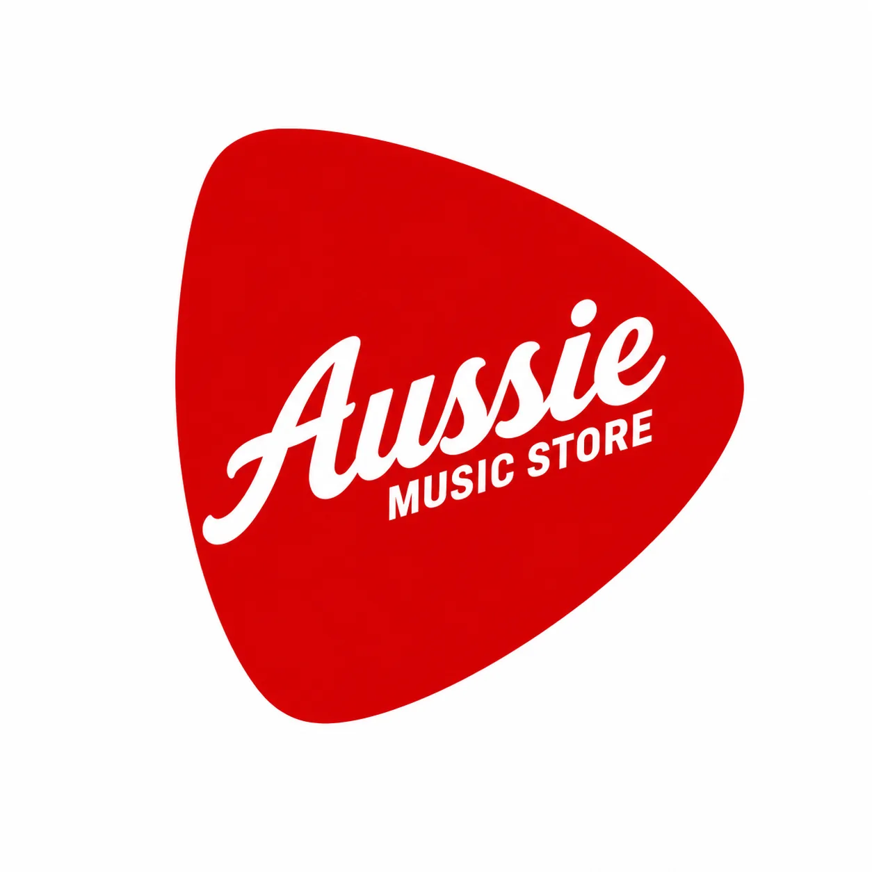
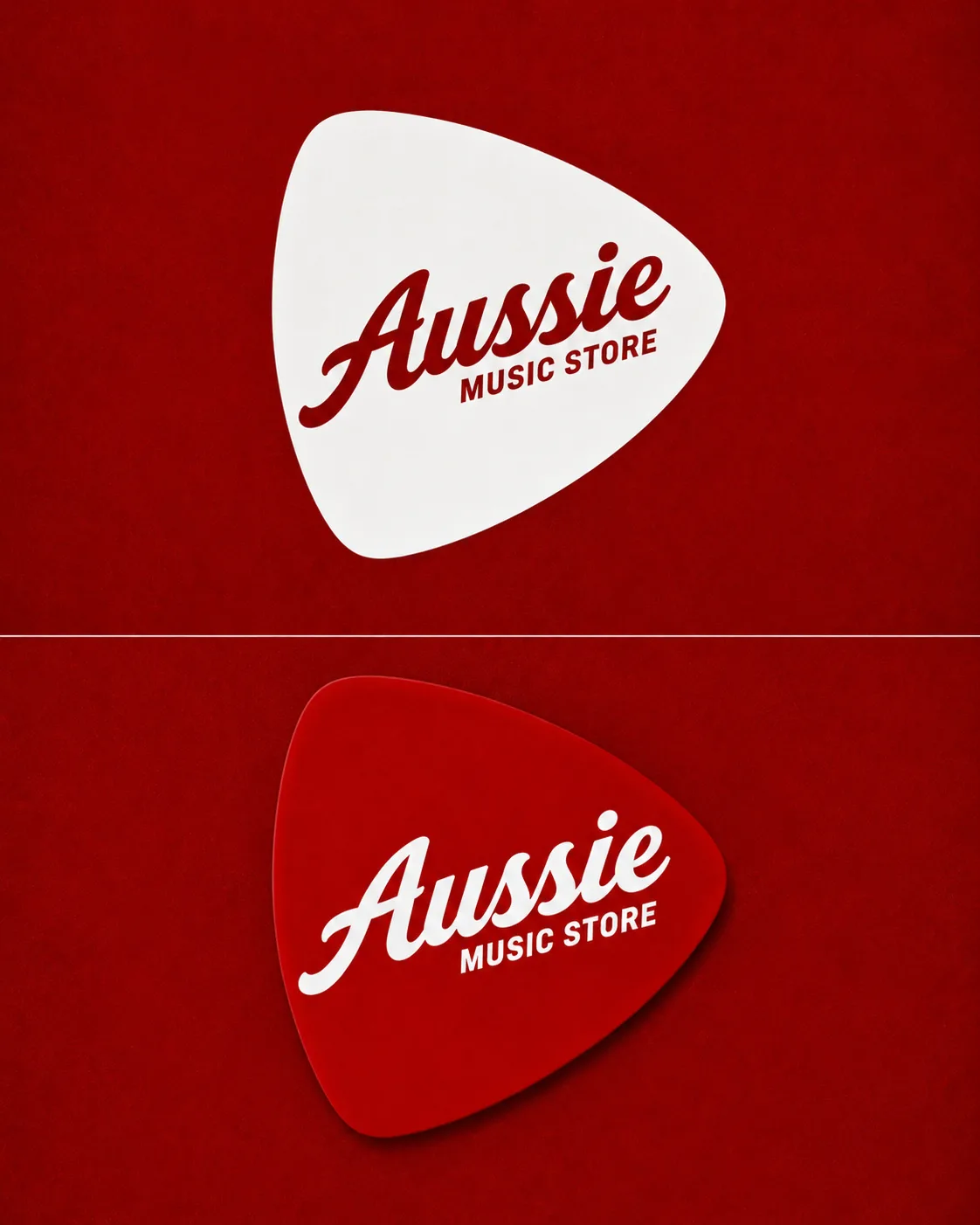
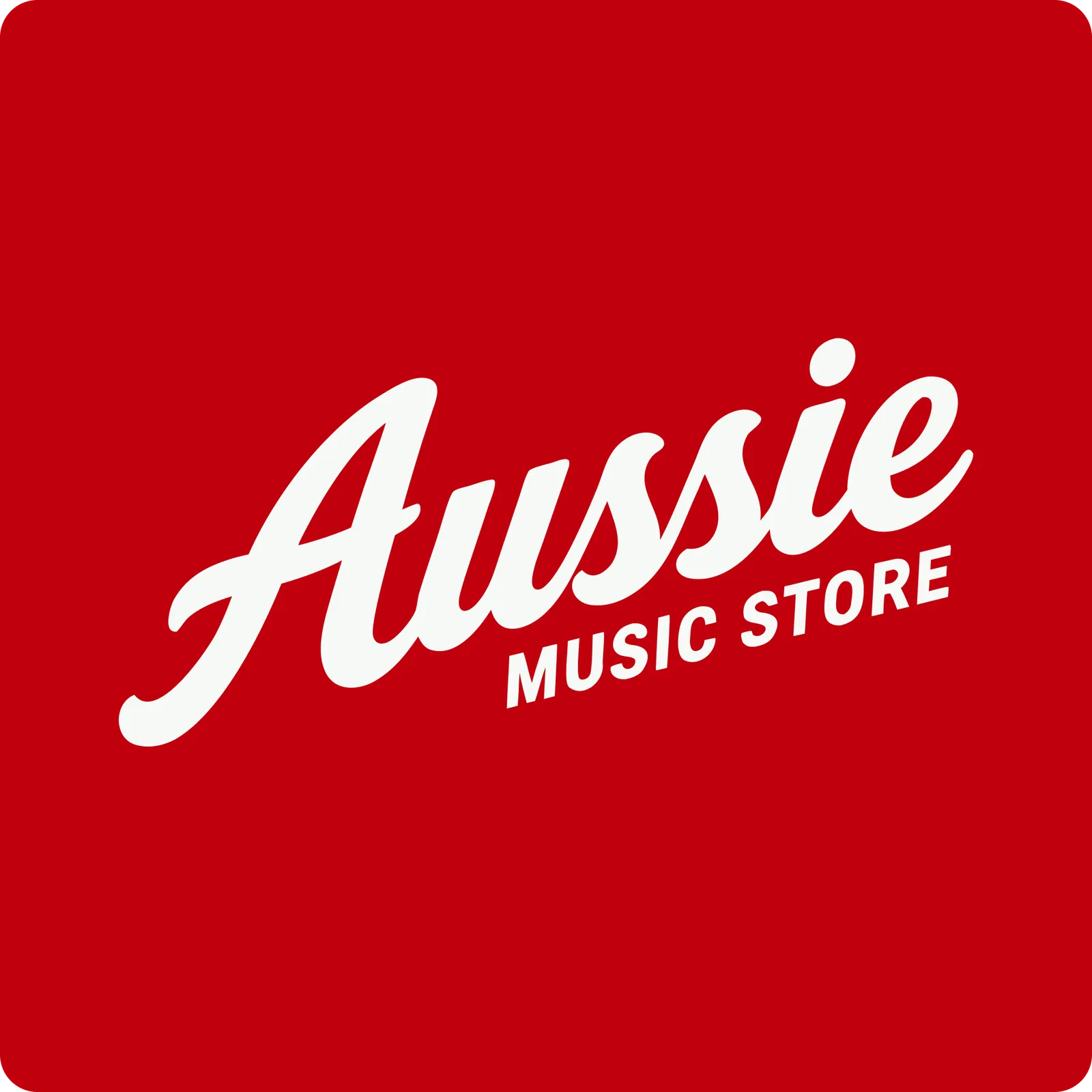
The central device is a guitar-pick shape: an immediate music cue and a flexible container for the name. A flowing script gives “Aussie” warmth and character, while the condensed uppercase “Music Store” descriptor adds structure and keeps the category clear.
Red and white create a direct, energetic palette that works in positive and reversed applications. The result feels confident at large scale but remains identifiable when reduced to a header logo or small retail touchpoint.
A Flexible Logo System
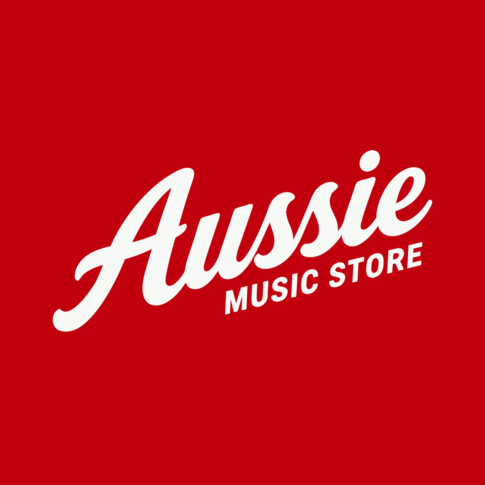
The identity can move between a contained pick mark, an open wordmark and cropped graphic compositions. That flexibility allows the same brand to feel controlled in functional areas and more expressive in campaign-led moments.
Light and dark pick treatments preserve contrast across different backgrounds, while oversized crops turn the logo into a recognisable graphic asset rather than a mark that always needs to sit neatly in the centre.
From Identity to Retail Expression
The system extends beyond the logo through musician-led imagery and branded merchandise. The red cap application demonstrates how the script mark can carry the identity independently, while the tightly controlled colour treatment keeps photography connected to the wider visual language.
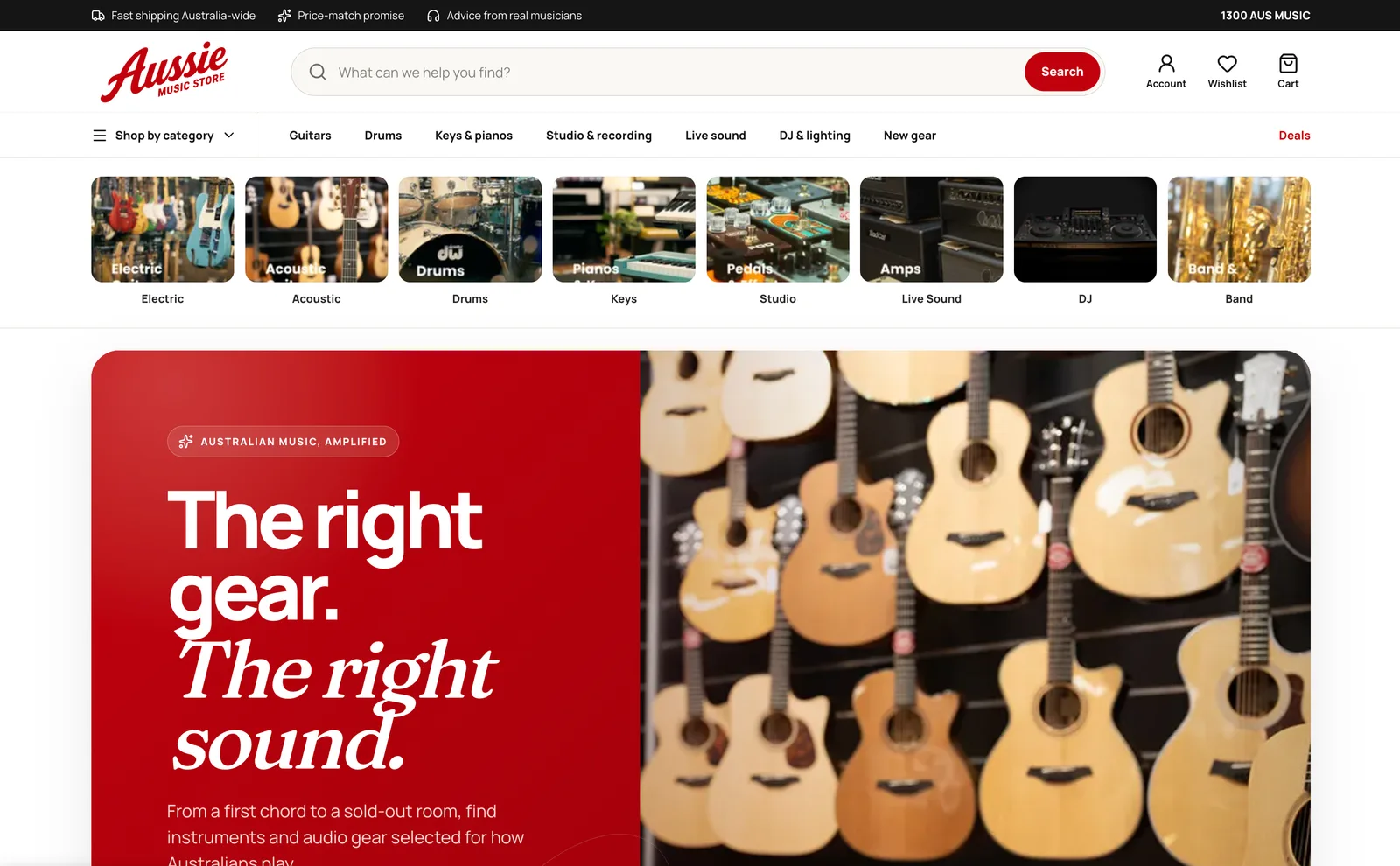
On the e-commerce experience, the identity supports rather than competes with shopping. The red palette guides primary actions and promotional areas, while a clear search experience, product-category navigation and rounded imagery keep a broad catalogue approachable.

The Outcome
Aussie Music Store now has a cohesive identity that can move from a small digital mark to merchandise, photography and large campaign compositions. The guitar-pick device gives the brand an ownable music cue, and the typography and colour system provide enough flexibility for both expressive storytelling and practical retail communication.
The e-commerce application brings those elements together in a recognisable customer experience without losing the clarity required for search, category browsing and product discovery.
Explore our approach to e-commerce strategy and delivery and web development.