CabFare Driver App UX/UI Redesign
Background
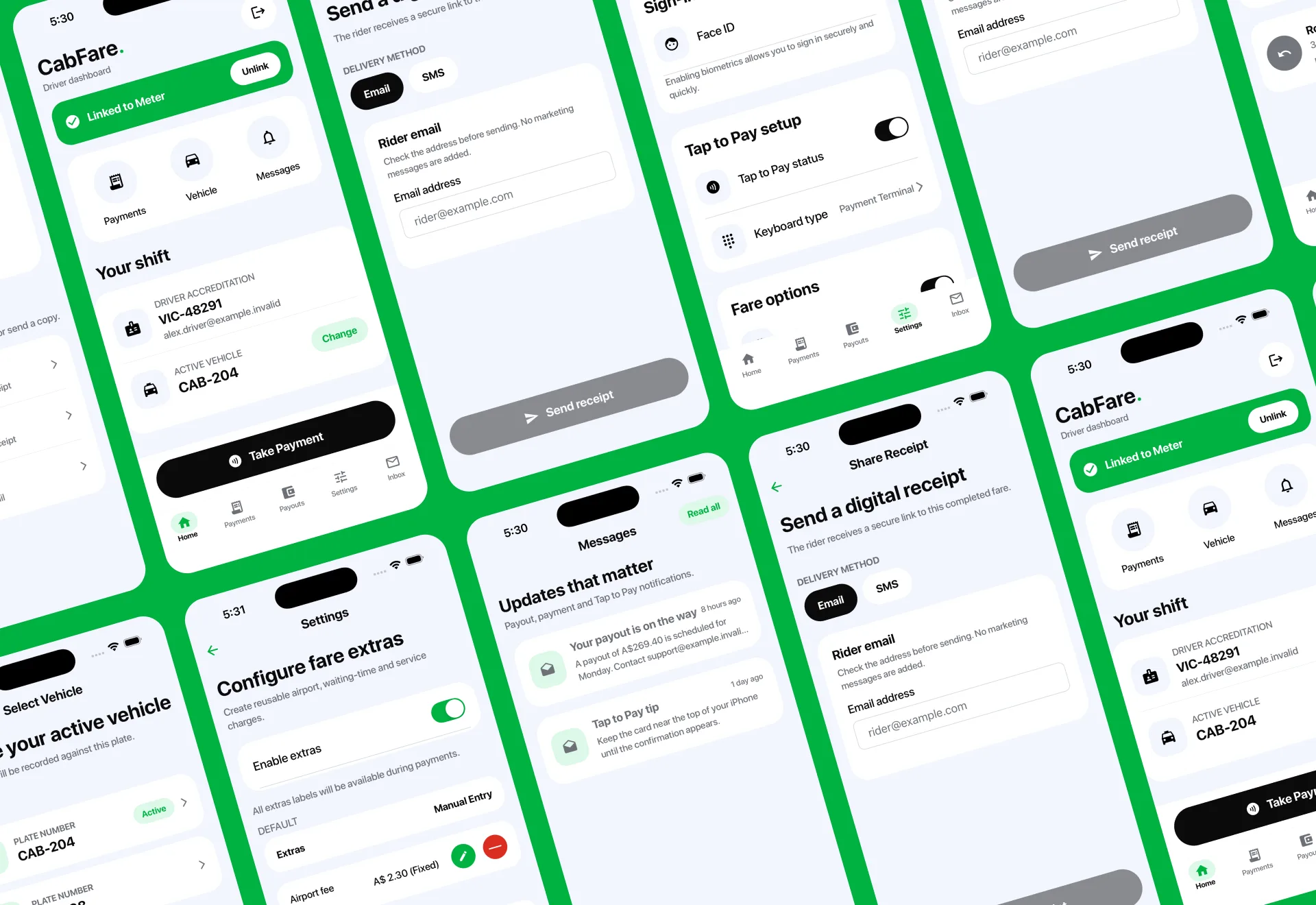
CabFare’s driver app supports the practical tasks that keep a shift moving: connecting a vehicle and meter, taking payments, reviewing payouts, managing fare settings, reading messages, and sharing receipts with riders.
As CabFare’s wider digital experience evolved, the app needed a clearer and more consistent interface to match. We worked with the CabFare team to redesign the product around the needs of drivers using it throughout a busy working day.
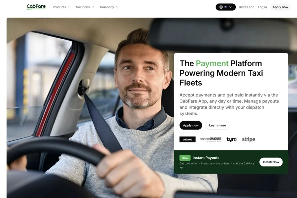
This project focused on the app experience itself. It complements our broader CabFare website, SEO, and digital growth work.
The Challenge
The existing app contained the right core functions, but the experience had grown visually inconsistent. Dense screens, competing actions, and uneven patterns made important information harder to scan quickly.
The redesign needed to:
- Create a cleaner visual hierarchy across the complete app.
- Make high-frequency tasks easier to identify and complete.
- Establish consistent patterns for navigation, cards, forms, actions, and status messages.
- Bring the product closer to CabFare’s updated brand and Tap to Pay proposition.
- Keep the interface practical for drivers using the app between fares and while managing a shift.
A Clearer Driver Dashboard
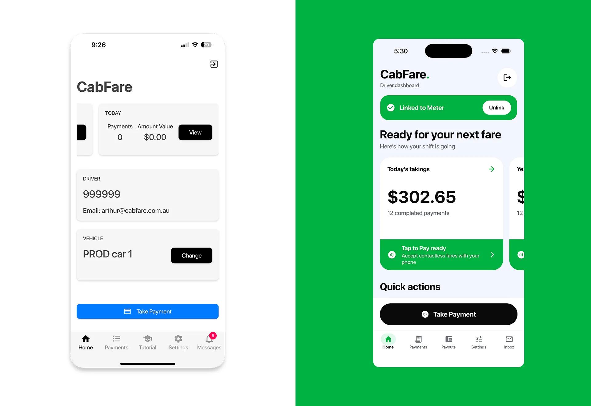
We reorganised the home experience around the information and actions drivers need most often. Meter connection status is immediately visible, shift performance is easier to scan, and the primary payment action has a clear position in the hierarchy.
Secondary areas—including payments, payouts, settings, and messages—use a consistent navigation system so drivers can move around the app with less visual friction.
Simplifying Payments and Receipts
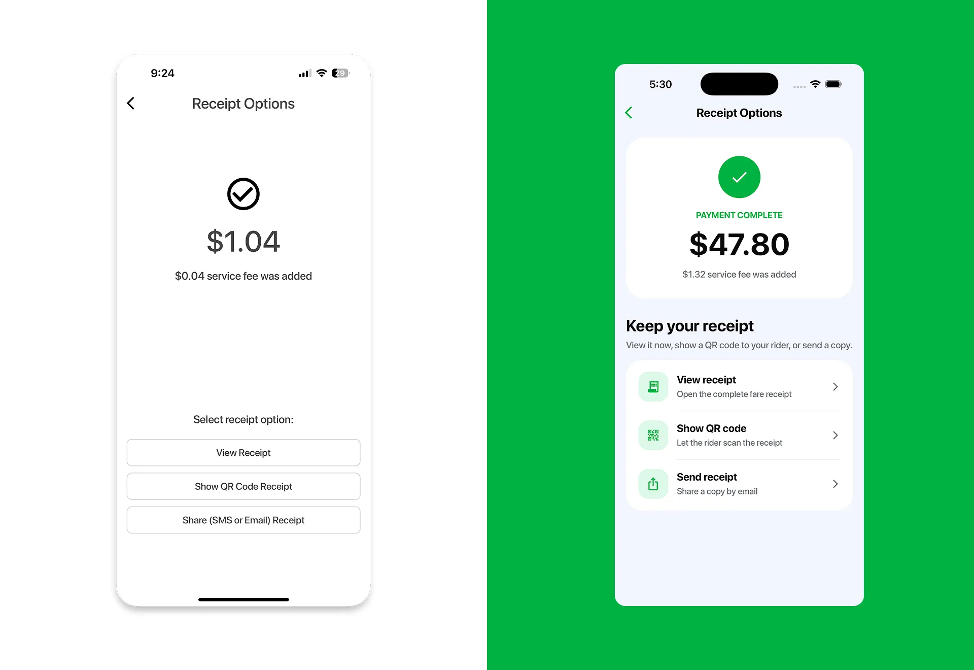
Payment completion and receipt sharing are important moments in the driver and rider journey. We redesigned these screens to make the completed state unmistakable and grouped receipt options into clear, descriptive actions.
Drivers can quickly understand the fare total and service fee, then choose to view the receipt, show a QR code, or send a digital copy. The revised layout removes unnecessary empty space and creates a more confident end to the payment flow.
Building a Consistent Product System
The new interface uses a shared set of patterns across the app rather than treating every screen as a separate design. Cards, buttons, form fields, icons, status colours, spacing, and navigation now follow the same visual logic.
That system was applied across:
- Driver, vehicle, and meter connection states.
- Tap to Pay setup and payment actions.
- Fare extras and settings.
- Payout updates and in-app messages.
- Digital receipt delivery by email, SMS, and QR code.
Google Play and Apple App Store Creative
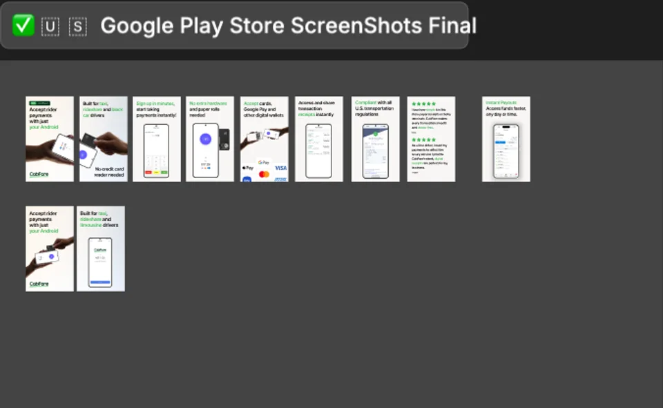
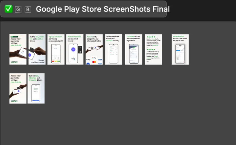
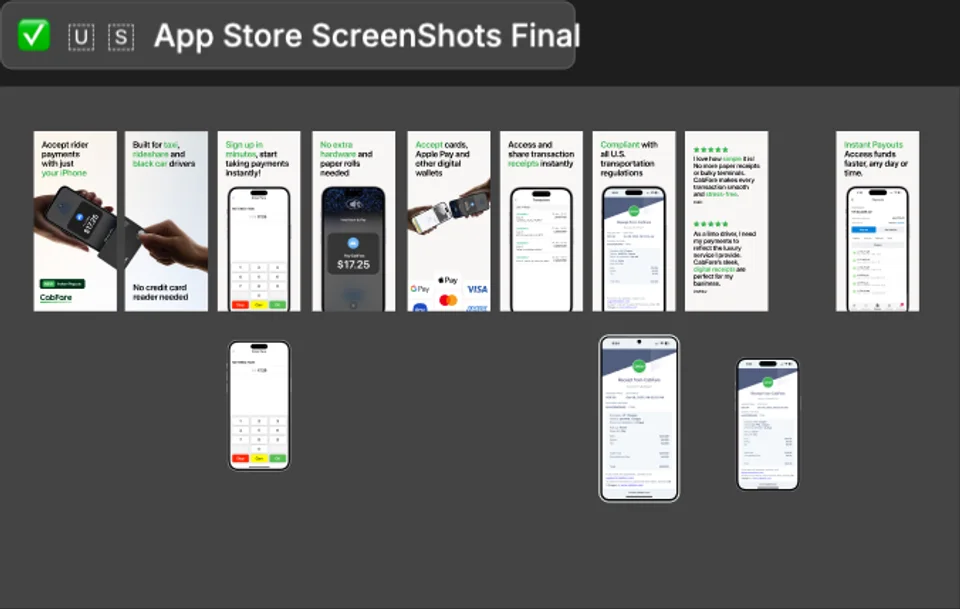
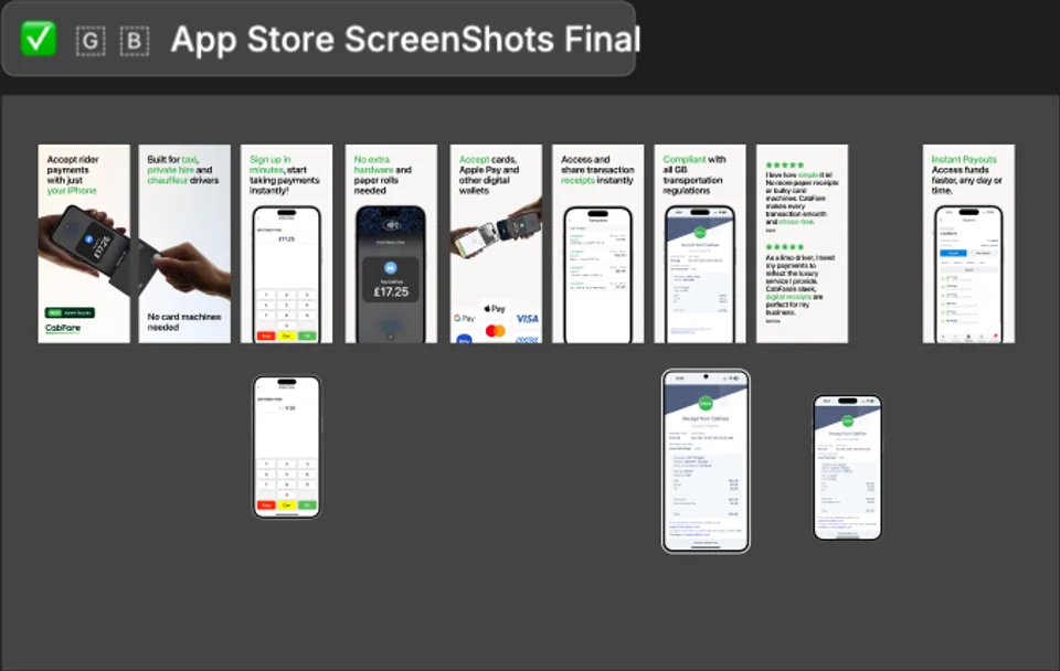
The redesign extended beyond the product interface into the way CabFare presents the app before download. We designed coordinated screenshot sequences for Google Play and the Apple App Store, adapting the layouts to each platform and market format.
Each sequence turns the app’s core value into a concise visual story: accepting rider payments with a phone, getting started quickly, supporting cards and digital wallets, reviewing transactions, sharing receipts and accessing payouts. Product screens, device photography, direct headlines and trust messages work together so prospective drivers can understand the offer at a glance.
The Outcome
The redesign gives CabFare a cleaner and more coherent mobile product direction across the app and its store presence. Important actions are easier to distinguish, information is grouped more clearly, and repeated interface patterns make the experience feel consistent from the first store impression through to payment completion.
The resulting design system also gives the CabFare product team a stronger foundation for future app features, helping new screens remain aligned with the same interaction and visual principles.
For drivers, the experience is more focused and easier to scan. For CabFare, the app now presents a modern product experience that better reflects the company’s payments technology and wider digital brand.